HALDEN
Brand identity
Concept
An export manufacturer that finally looks the part.
The starting point
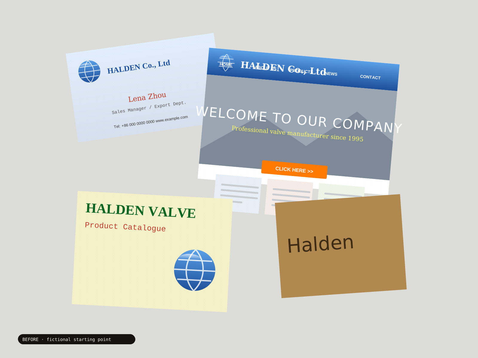
A fictional valve maker with thirty years of engineering and a logo nobody remembers choosing. Its catalogue, trade-show booth and business cards each looked like a different company. The question: how should precision look to a buyer seeing the brand for the first time?
The point of view
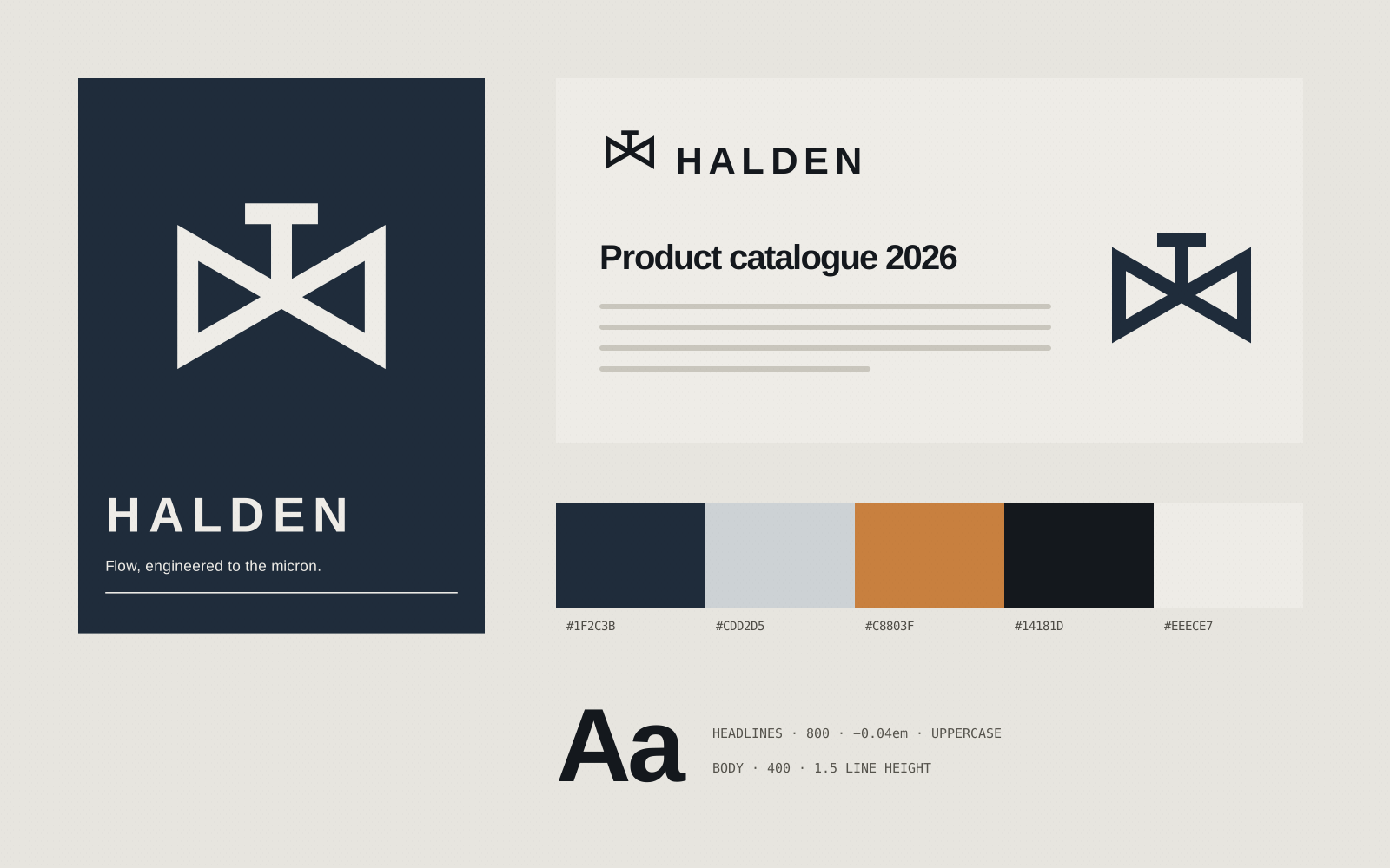
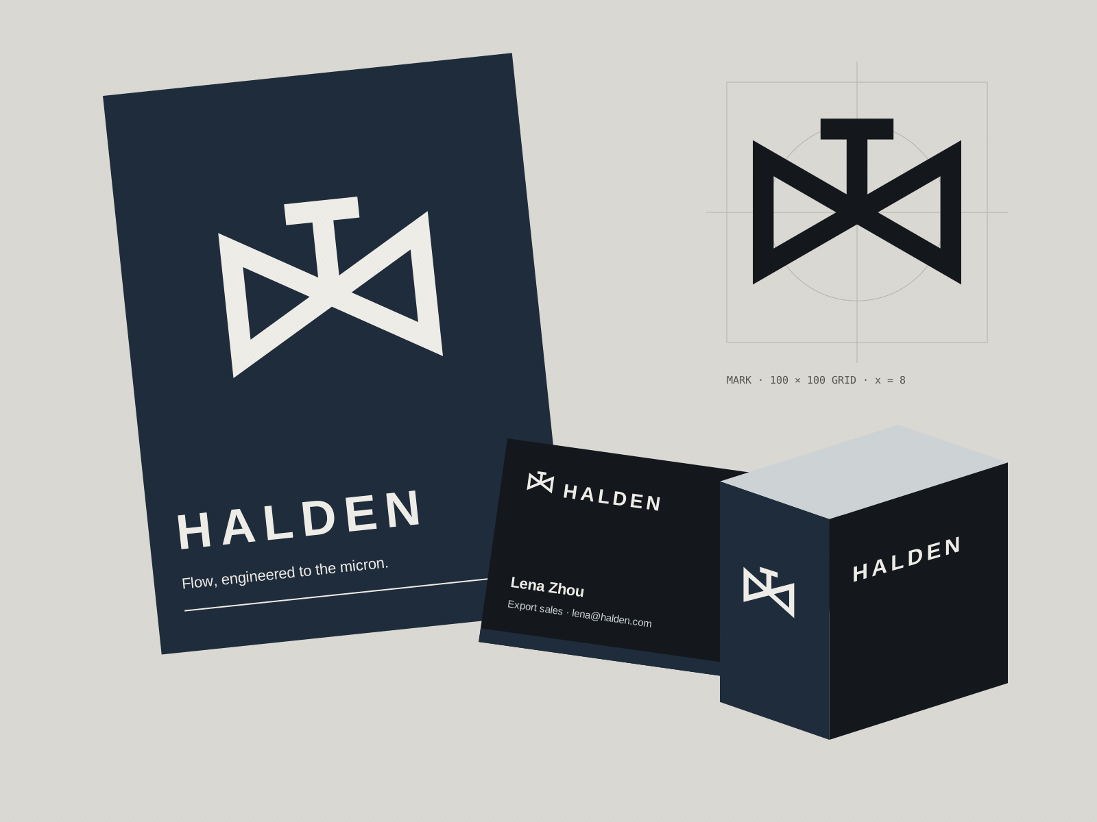
A ring cut by a single line of flow, drawn on a strict construction grid. Signal red, steel grey and heavy uppercase type carry from the catalogue to crates, test certificates and the booth.
What we explored
- Logo & construction grid
- Brand guidelines
- Catalogue & data sheets
- Packaging & trade-show booth
A self-initiated design study. The name, visual identity and applications are fictional explorations, not commissioned client work.
Before and after · Drag to compare
In application